We’ve all used awful government websites. There’s been great progress thanks to legislative action in recent years mandating user-centered design, accessibility, digitizing paper forms, and tech standardization. But there’s still a lot to do. I’d never gotten the opportunity to do a government project, let alone a large federal greenfields one, so I jumped at it.
Did I give you a password? Click here.
From 2022-2025, I served as UX lead for a complete redesign and re-platforming for an agency of the US Department of the Interior (DOI). My duties on the project included participating in an extensive discovery & strategy writing exercise, leading all design efforts, supporting research and content strategy, customizing the US Web Design System (USWDS) inside a Drupal theme, and front-end development. The project also demanded delicate client relations work, and I had to pass a Public Trust background check.
Did I give you a password? Click here.
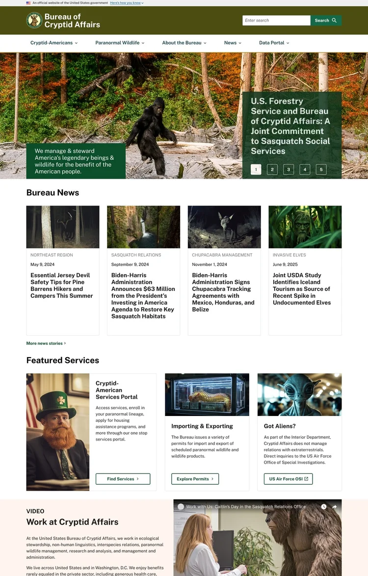
Important Note: As of this writing, the site described here isn’t live. To respect confidentiality agreements, this case study uses artifacts and designs for a fictional agency, the Bureau of Cryptid Affairs. While imaginary, these samples are representative of my team’s UX process and its design outcomes in the actual project. (They were also a ton of fun to make; I used Midjourney and ChatGPT 4o for the photos). I’ll be able to unveil the real product later in 2026.
Forging a Strategy: Agile vs. Institutional
As you may have heard in the news recently, quite a few military veterans work in the US civil service. This shows up in part as a strong culture of rigorous planning. Most of our team had worked in the private sector, steeped in Agile thinking, before our DOI engagement. Spending months writing a strategy before redesigning a web presence was the opposite of how we were used to working, but we made good use of the time.
We used the opportunity to conduct design and technical research on possible approaches, to interview dozens of project stakeholders on their pain points and expectations, and to map out all the administrative levers we’d need to pull on later to succeed. Government work has a lot of rules to learn. If you’ve only ever worked in the private sector, it’s important to come in with an open mind. I spent a lot of time examining both digital strategy documents and websites produced by other federal, state, tribal, local, and foreign governments to report on trends and exemplars. With six authors cranking out a long document with overlapping subject matter, I organized an editorial workflow based on my publishing experience and took on the managing editor role in the resulting structure.
The resulting digital strategy was adopted by the 10 person executive sponsorship group, on schedule, after a few rounds of revisions. The strategy covered a wide range of topics such as complying with relevant laws like the 21st Century IDEA, building in accessibility, adopting a design system, committing to technology supportive of strategic goals, and measuring the results via actionable KPIs.
Sequencing the Work
We had to be flexible with the order in which we built out various aspects of the site. Organizational barriers made it impossible to proceed in a straight line path on key aspects of the design, such as the IA. I had to plan and estimate for a variety of scenarios on the UX side. I also helped the product owner and agile practitioner on our team develop an overall plan for our anticipated 3 years of work by running workshops like Yay, We Did It! and Critical Path (a massively simplified variant on critical path analysis) to game out our approach. The resulting project plans were firm enough for government scrutiny but adaptable enough to respond to the highly political and risk-averse government environment.
Discovery: Design Research
Federal graphic design is a deep and pleasing rabbithole for design research, and this project provided ample opportunities to fanboy about the likes of Bus Carrell (creator of the iconic US National Forest signs) and the team who created the NASA worm logo. Although not a re-brand project, I did have a green light to translate the agency’s existing identity into a modern web design system. I used AI to innovate on the traditional practice of building a moodboard. In a workshop where I had the design stakeholders collaboratively build a moodboard for the project, I then used the moodboard as a prompt to create some imaginary designs. Discussing what the stakeholders liked about these lead to a solid set of design goals we came back to for the rest of the project.
Organizational Hurdles
Up until a late 2024 clarification issued by the Biden administration (which was left in place by the current regime), the Paperwork Reduction Act of 1995 strictly limited certain UX research activities. The bill’s framers had probably only heard of the World Wide Web that week, and “UX Researcher” wasn’t a job title that existed yet. Under the law’s old interpretation, it was illegal to create a survey without a months-long approval process. This applied to both recruit screening surveys and the actual research. By developing relationships inside the agency and becoming familiar with exceptions in the law, we were able to proceed.
This is just one example of a spot where our project had to steer around rigid policies. It slowed the pace of work, but I learned a lot about how to work within this type of bureaucracy.
Discovery: UX Research
Further discovery research for this site included a Top Tasks survey, user interviews, and a review of analytics. I served as note-taker and co-analyst on the interviews and conducted the analytics review personally. What we turned up was a website with:
• High bounce rates on key pages
• Frequent use of agency jargon unfamiliar to the public in nav labels
• Total reliance on Google searches rather than the site’s own nav for users to find what they needed
• General misalignment between what site visitors were looking for and what content was featured prominently
Easy, right? No, not really.
Definition: Honing a Look
We had a good set of design priniciples to work with, but it was now time to get more specific. In a series of collaborative design workshops, I facilitated stakeholder activities to:
• Define things how their existing color palette would be applied to the design system
• Experiment with how a design system could be used to re-create existing features
• Identify key parts of the site to consider when creating the design system
Pictured here is one participant’s contribution to a workshop where each person did a show & tell of government websites the loved and/or hated, followed by a discussion of the design direction for their own site. Activities like this built a collective sense of ownership of the designs among client stakeholders.
Design: Form Follows Features
By now we had a new take on the client agency’s digital visual identity that they were comfortable moving forward with. My researcher/content strategist was still untangling the IA at this point thanks to the twists & turns of agency politics. But user interviews and other research had given us a strong idea of which parts of the site needed the most love. So, using a provisional IA, we embarked on feature design.
The US Web Design System is pretty comprehensive, but I didn’t immediately customize every component with the new look & feel. Every design system looks nice and neat as its creators present it, but once you start using the components with real content, the warts emerge. Diving into specific features like the agency’s jobs page started a feedback loop that lead me to the best fit between USWDS and the agency’s real needs.
We now knew that we were in part serving a user population who are frequently in rural areas with weak signals and older phones. Every screen on the site—even functionally complex ones like the agency data portal search features—would need to work on a 320 width phone.
Prototyping
During the project, we held several cycles of user research, including user testing key features like the home page. It had been a long road to acceptance of our information architecture (IA) plans. Successful testing of the home page was crucial to selling executive sponsors on the overall vision, and it did the job. Along with user testing, interviews, surveys, and analytics reviews combined to make the case for our site map.
Iteration & Implementation
With each cycle of research, we further refined the design of the site. Deep dives on several key features like the agency’s newsroom, grantmaking timelines, and data portal resulted in adding some custom components to the design system.
As features reached design approval, I was then responsible for building them in Storybook using HTML5, compiled CSS, twig, and yaml. Once my push requests were accepted by the lead engineer, components were made available in Drupal and used to build out actual pages.
In our time on the project, we redesigned virtually every aspect of the agency’s web presence while shifting it to a modern digital experience platform.
The real website is scheduled to launch in 2026.
Did I give you a password? Click here.